Monday 14 March 2016

Q7 (BLOG) - Magazine Evaluation

Looking back at your preliminary task, what do you feel you have learnt in the progression from it to the full product?

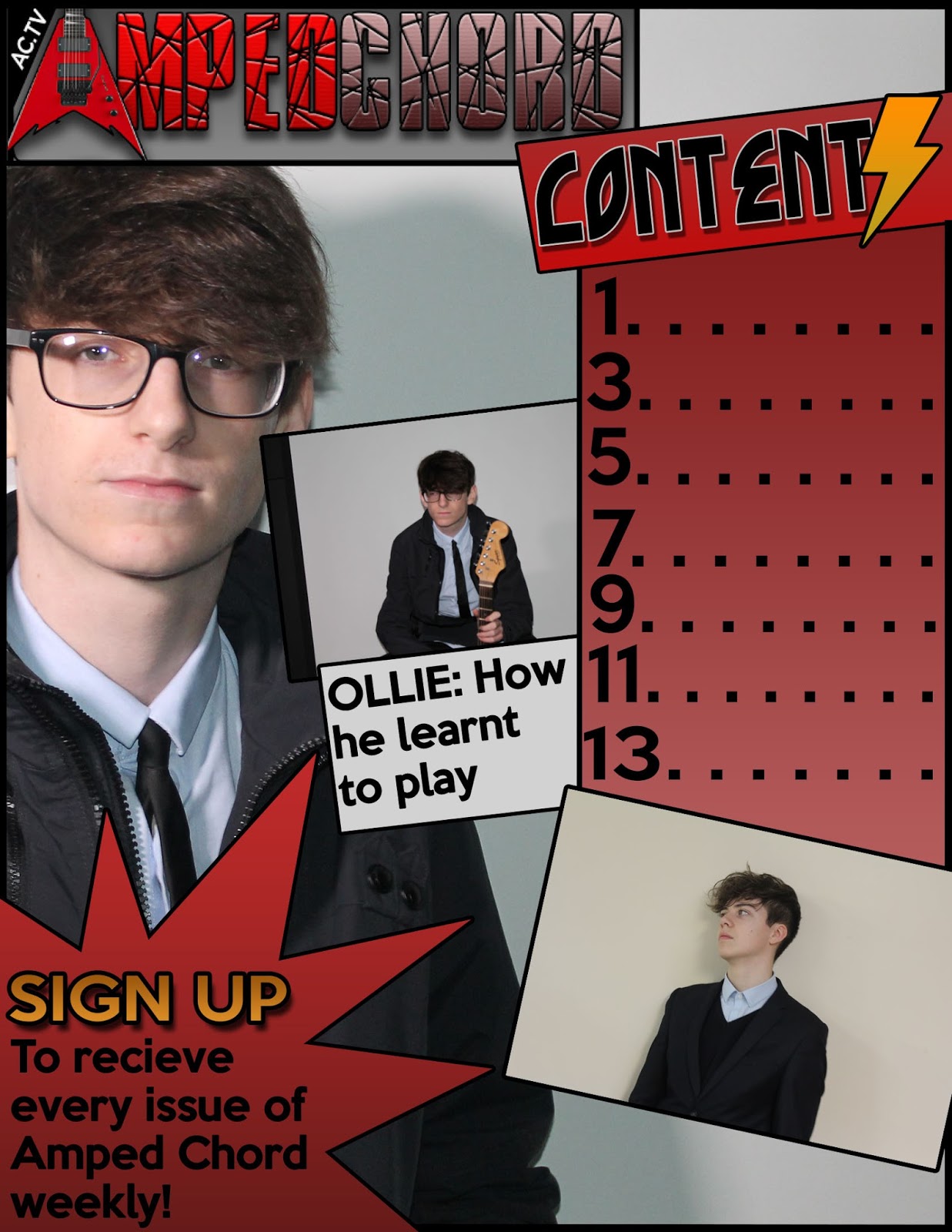
In my front cover I didn't have any sort of planning for my pictures, no planning made it much harder to get the pictures done quicker and they hadn't come out as I hoped. I learnt that careful planning into my photoshoot meant that I could spend less time working on it without the worry that it may not come out as I wanted it to. This gave me more time to spend on the rest of my magazine and further improve it. My skills on photoshop also improved a lot during this time from my preliminary task to my final product as I took time to look at tutorials, I did this to ensure I knew what I was doing once I got to the final task. In my preliminary I also made a mistake in using too many different colours, this made the front cover look messy and confusing to the audience and I used this knowledge in my full product to use minimal colours that fit the genre of rock. Before starting my final product, I had a look at my preliminary task and came to the conclusion that I frequently used the same fonts on my cover, this made it look rather boring and wouldn't really interest the audience, as a result of this I used a variety of fonts to make it look more interesting and fit the genre better. Overall, I saw that I needed to put a lot more effort in the little details of my front cover and I improved many things including the title, here I added an electric guitar to substitute for the letter 'A' to make it more creative. I added the same ideas to my contents page and double page spread as I had not done these before. This time round I had carefully planned out what my title would be and what pictures I would use and where everything on the page would be placed, this was beneficial as it was less stressful and time consuming like it was on the preliminary; I didn't plan in great detail for this task when I should have.

Over the space of time from the preliminary to the full product, my photoshop skills have improved as well as my planning, time management and camera skills. I learnt how to create my own magazine from scratch using my own resources and made it look professional and how a real music magazine should look. I have also picked up various skills and knowledge about terminology such as convergent links which will hopefully help me in the future in this lesson. Finally, I found out many ways in how to address my audience and fit the magazine to appeal to this particular audience.

Preliminary task:


Full & final products:


Friday 11 March 2016

Question 4 - Magazine Evaluation (BLOG)

Who would be the audience for your media product?

The audience that my product is intended for is young adults from the ages of 18 to 24 who would also read magazines like KERRANG and NME. My product is a niche because the cover star and other rock stars involved in my magazine such as Oliver Riches and Cameron Bird are not well known rock artists.  Because they are up and coming artists there is generally a lot of interest surrounding their music which would make it popular with young people and an interesting read.

Wednesday 13 January 2016

Flat Plan - Rock Magazine Double Page Spread


I have now sketched up my flat plan for the double page spread, I have included words that will attract the reader such as 'world exclusive', lots of pictures to appeal to my target audience of young teens to sound adults (around 18-24), a convergent link in the top right of the page and finally a quote from the artist, this is effective in making the audience feel involved with an exclusive quote and story.

Monday 11 January 2016

Flat Plan - Rock Magazine Contents Page


I have sketched my contents page for my magazine to get a rough idea of how I'm going to make my final product and what it should contain. 

Tuesday 5 January 2016

Flat Plan - Rock Magazine Cover


Here is my flat plan for the front cover of my rock magazine, I have included my chosen name 'amped chord' that is relevant to the rock genre with an electric guitar to take place of the letter 'A'. Free offers and posters have been included which was mentioned in the questionnaire and is a popular way to get an audience to buy a magazine. Many pictures have been included to appeal to my target audience and exclusive stories and quotes are used to show the audience they will only get these stories from my magazine only. Finally I have included an 'upcoming rock legend' who will attract a wide audience who may be his fans.

Sunday 3 January 2016

Potential Magazine Images & Image Plans


These are images that have been taken that I could potentially use in my magazine front cover, contents page and double page spread. A wide range of photos were needed so I had a variety to chose from so I don't have the same image in each page.


Some of the images had come out so when they were enlarged they became very blurry, I have made the decision to use these photos as extra pictures in the pages to add variety, however I must keep them small so they don't show up blurry when my final products have been completed.

I had to have some planning prior to taking these shots so I knew exactly what type of images I wanted to fit on my pages, I took into consideration what needed to be included as mise en scene, for example, electric and acoustic guitars and dark clothing.


Masthead Name

I have looked into what I should have to be my title of my rock magazine. When you think of rock music electric guitars and amplifiers spring to mind, this is what I would base my ideas of the name my magazine around, here are my ideas:

  • Amped - This came to mind as I thought of the amplifier which is amp for short, the amplifier is used to make the electric guitar sound the way it does in concerts so it is relevant to the rock genre. Amped is also a word used by young adults as a way to say that they are full of energy/fired up. The use of this word appeals to my target audience as they will understand what it means and relate to this feeling of being at a rock concert. A variation to this name is Amped Chord, I needed some variety to move to if amped on it’s own wasn’t working, a chord is also a term used by guitarists.
  • Unplugged - This is a term used in the rock industry to show that a rock band had used an acoustic guitar for their music rather than the electric guitar.
  • Distorted Chord - A distorted sound is used by many rock guitarists with the help of amplifiers, the chord is an arrangement of notes that a guitarist puts together to make music. This makes this title relevant to the rock genre as the sound made by the electric guitar is distorted.
  • Blare - The term is used to describe a loud sound which closely relates to rock music, it is like the roar of the guitar from the amp.

Now with my ideas I needed to find a design and font to use for my masthead; most of the name ideas are related to the sound made by an amplifier which is a distorted sound, however, I thought that it would be better to use a font that had a shattered effect to it which links to the rock genre, like they have been seen smashing their guitars on the ground in concerts. The font is Broken Glass and this is what it looks like with my masthead name ideas: